
I have a few shortcuts that show me the status of my devices on the network. For example, I can see the current data from my solar panel system. Unfortunately, Apple Shortcuts has very limited graphic options for this. Showing the results as a widget just wasn’t possible, so the best I could do was this:
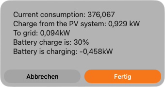
Simon B. Støvring, developer of Scriptable and Runestone, has released a beta version of his new app, Canvases. It solves the problem of displaying Shortcut data as a widget. The result is much nicer and easier to read.
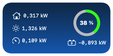
How it works
Everything I describe here is based on the 2018 beta build. Since Simon B. Støvring releases new updates in TestFlight almost daily, the build number may change quickly. Therefore, changes in later betas or the final release are possible.
The Canvas definition
The widget is defined in the Canvases app. This includes the visual design, layout elements, and placeholders that are later filled with results from a linked shortcut. For my example, it looks like this:
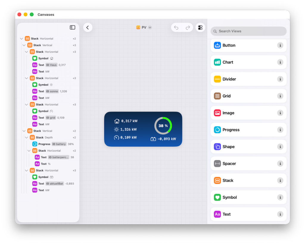
The left panel shows the current structure of the widget. The middle panel shows a preview. The right panel shows the different elements that can be used in a widget. Clicking on an element adds it to the end of the tree in the left panel. Then, you can move it to the desired position.
Each element has its own properties, such as foreground and background color, as well as spacing. These properties allow the shortcut to control how something is rendered. For example, the shortcut can change the text color from black to red once a certain value drops below a threshold.
The shortcut
To retrieve current data from my solar panel system, I access an internal service. The result of that call is stored in a dictionary. I read the raw data from the dictionary and process it further. I go through the dictionary entry by entry. Here, the raw value is shown under the key pv_feed_in_w. This value is in watts. Before writing it into the variable togrid, I convert it to kilowatts by dividing it by 1000 and rounding to three decimal places.
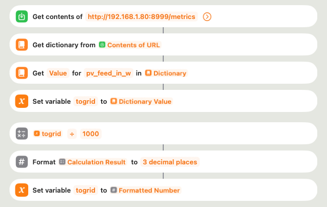
In order to display the value of the variable in the widget, it must be passed to the Canvas. The shortcut uses the Canvas action Update View to do so.

This action sets the “Text” property of the placeholder “grid” in the Canvas definition named “PV” to the content of the shortcut variable togrid.
This method writes each dictionary entry into a variable, which is then displayed as text in the widget. The battery charge level in percent is the one exception; it is shown in the widget using the Progress element. The color of the ring is set to red below 11% and green above 11%.
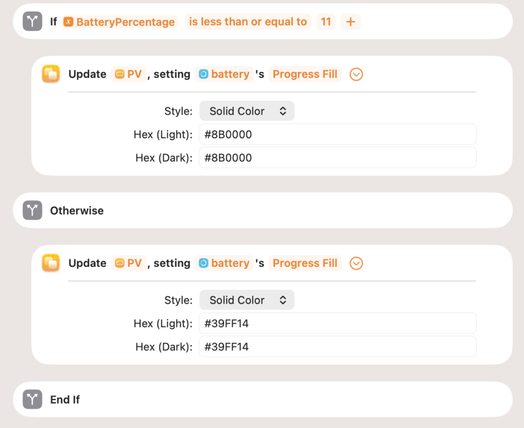
Not all the widget’s content is derived from variables. In this example, icons and units are fixed in the Canvas and are not set by the shortcut. Once all the variable values have been passed to the Canvas, all that’s left to do is add the widget to the home screen or desktop. After that, the widget is updated with new solar system data every time the shortcut runs.
I was surprised to find that running the shortcut on one Apple device updates the widgets on all my devices. This is because the data is saved into the Canvas definition and synced through iCloud. This means the widgets on other devices receive the new data after iCloud syncs the file.
Layout elements
A widget’s layout is primarily composed of the Stack layout element. Content can be arranged horizontally, vertically, or with overlapping elements (Depth). In this example, the layout looks like this:
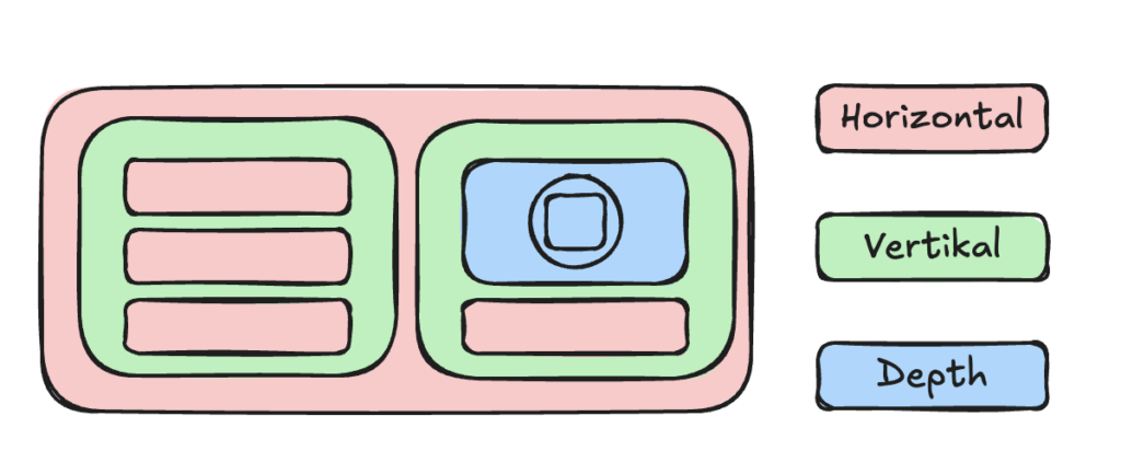
A Stack with the depth property is used to show the percentage inside the progress ring.
All elements offer additional properties, such as font (for text elements), color, and spacing. These properties can usually be set through the shortcut, and they are available for almost every element. While fine-tuning these settings can be complex, the defaults are usually sufficient.
The Grid for repeating views
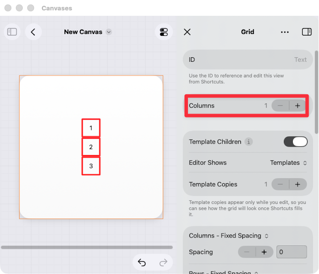
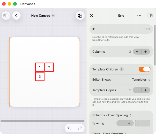
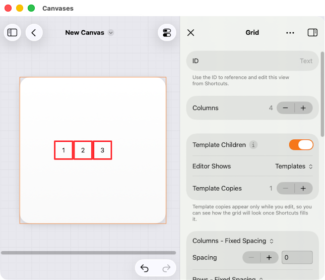
The Grid is a special layout element. As its name suggests, it arranges its elements into a set number of columns. The layout tree looks like this in the following examples:
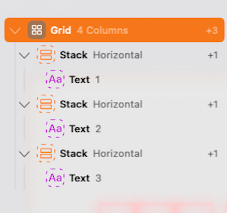
The only difference in how it looks is the number of columns (highlighted in red in the first example).
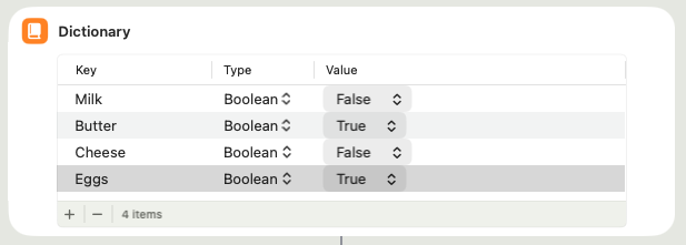
A Grid is special because it can be filled with repeating content of the same type. For example, this can be done through a loop in the shortcut. To illustrate how this works, consider a simple example: reading key/value pairs from a data source, in this case a shortcut dictionary. In this scenario, the keys are a few dairy products, each with a true/false value indicating whether they need to be purchased.
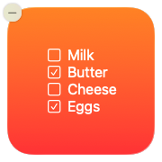
The widget’s output should end up looking like this:
For the Canvas definition, the Grid needs a Stack that serves as a template with placeholders for the checkbox and text for the product.
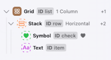
In theory, you could query the dictionary for each row in the shortcut and define a separate Stack each time. However, this method is not very flexible if a product is added or removed. It’s simpler to query the dictionary only once.
For the shortcut to work properly, each element must have a name. You also need to activate the “Template Children” option in the Grid’s properties (1).
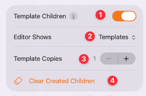
The “Editor Shows” switch (2) determines if the preview shows the template’s placeholders or the data from the last time the shortcut was run using the “Created Children” option. This option is unavailable if the shortcut hasn’t run yet, and the “Clear Created Children” row (4) is also hidden.
Enabling “Template Children” transforms the elements in the Grid into a template. The template can then be filled with data from the dictionary using a loop.
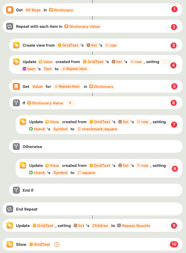
Since the dictionary must be processed in a loop, all keys are first read into a list, which is then looped over (1). In each iteration of the loop (2), a new view is created from the template (3) defined in the Canvas and its placeholders are filled with data.
In step 4, the key of the current loop item is read using Repeat with Each Item. It is then written as text into the placeholder item in the copy of row that was just created inside the Grid list.

The value of the key/value pair must also be written into the corresponding placeholder, check. The template defines the element check, which displays an empty or checked checkbox depending on the value. First, the value of the current key is fetched (5) and passed as a true/false value into the If action (6).
Similar to passing the current key, this fills a placeholder. However, here the property is not Text; it is Symbol. In the “true” case (7), the symbol checkmark.square is used, and in the “false” case (8), only the symbol square is used.
The loop will end after it has processed every entry in the dictionary and created a view for each one based on the template. The result is a list of filled rows, called the “children” of the row template.
Finally, the Grids list in the “GridTest” Canvas is updated with the result of the loop. Unlike inside the loop, it doesn’t use the Update View Created from Template action. Instead, it uses the regular Update View action to fill the children property of list with the list of views from the loop.

You can also build more complex widgets filled with multiple Grids, like Simon’s “Month Calendar” widget, which he uses as an example on his website.
Keep in mind that widgets have fixed sizes, so they can’t display an unlimited number of rows or columns. If there is more data than can fit, the shortcut must handle that by limiting the number of loop runs. Overall, the combination of Grids, templates, and loops leaves plenty of room for discovering more ways to solve problems.
Use cases
The Canvases app offers a new way to display shortcut results as a nicely designed widget. You can use any data source that a shortcut can work with. This includes interfaces to devices on your network, such as my solar system; internet services for weather or survey data; and data collected right on the device. For example, you can display your steps from the last few days from the Health app as a bar chart. The overview of my solar system is just one example. Instead of opening the PV app or website several times a day, I can see the current values right on my desktop.
However, there is one limiting factor when using widgets: the data update rate is limited to around 40–50 updates per day. Initially, I planned to use launchd on the Mac to create a solution that runs the shortcut every five minutes. However, I had to abandon that idea, also because it isn’t possible on iPhone or iPad.
At least the Automation feature in Shortcuts lets you run a shortcut at a specific time. For example, you can set it to update activity data every day at 11:00 p.m., so you can check how active your day was before going to bed.
Instead of automatic updates, you can place a button on the widget that, when clicked, starts the shortcut and loads the newest data. The app lets you add a URL to the button element in the Canvas definition for this purpose. On iOS, iPadOS, and macOS versions prior to 27, this launches the shortcut via the following URL:
shortcuts://run-shortcut?name=Shortcut%20Name
Starting with system version 27, there is also a “Run Shortcut” action that I have not yet tested.
When the shortcut is run via the button, the Shortcuts app opens and remains in the foreground. As a workaround, you can add an action to hide the Shortcuts app at the beginning of the shortcut.

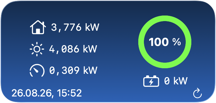
I expanded on my example of a solar system by adding a button and a timestamp of the last update.
As an alternative to the Canvases app, Simon offers Scriptable, which can be used to create widgets using JavaScript. For this app there is also a community that offers ready-made scripts like this one: A curated list of awesome Scriptable scripts and widgets.
However, Simon has created a more accessible way with the Canvases app through the Shortcuts app. I think a community around the app will form very soon.
Notes
While iOS and iPadOS already run quite smoothly, the Mac version still needs work. For example, at least up until version 2021, I couldn’t reorder elements in the tree, so I created the example Canvas on my iPad. It syncs automatically, which can take a while, but then it works on the Mac with the matching shortcut.
So far, I have only built fairly simple examples without complex layouts. I still need to dig deeper into this topic since there are quite a few adjustable parameters that make it slightly complicated.
One thing I haven’t tried yet is using the AI feature to create a canvas. According to the documentation, providing a simple description of what should be displayed is enough to automatically generate a matching Canvas.
With the Canvases app, you can share a Canvas along with its matching shortcut. This creates a link that, when clicked, installs the Canvas and then the shortcut via an iCloud link.
Overall, I think the Canvases app introduces new possibilities for Shortcuts by allowing you to present your data and analysis in a visually appealing way as a widget.
Leave a Reply